LIFESTYLE
Transform your home with our expert guide to the best color palettes for Mid-Century Modern interiors. Discover iconic hues and timeless combinations.
BY KAZEEM ADELEKE, ARTCENTRON
The Mid-Century Modern design has stood the test of time, celebrated for its clean lines, functional forms, and timeless appeal. Originating in the mid-20th century, this style transformed interior aesthetics with its emphasis on simplicity and purpose. Color plays a crucial role in shaping the character of Mid-Century Modern spaces—enhancing design elements and creating a cohesive, inviting atmosphere. Choosing the right color palette is essential to fully capture the spirit of this enduring style.
Understanding Mid-Century Modern Color Theory
Mid-Century Modern color theory stands out for its unique blend of optimism and innovation. Designers of the era gravitated toward specific hues, often drawing inspiration from both nature and the excitement of new technologies. This period celebrated modernity, favoring subdued tones that created a calm, neutral backdrop. At the same time, bold accent colors were frequently used to inject energy and contrast. The interplay between soft foundations and striking highlights resulted in dynamic, balanced interiors. Understanding these principles is essential for selecting the best color palettes for Mid-Century Modern interiors.
Key Characteristics of Mid-Century Modern Colors
Mid-Century Modern colors possess key characteristics. They are often earthy. Think of muted greens and deep browns. They also feature vibrant pops. Oranges, teals, and mustards stand out. The palettes are rarely monochromatic and typically involve a mix that creates visual interest. Designers used color to define zones. They highlighted architectural features and emphasized furniture pieces. These characteristics are fundamental as they guide the selection of the best color palettes for Mid-Century Modern interiors.
Earthy Neutrals: The Foundation
Earthy neutrals form the bedrock and they provide a calm base. Think of warm grays. Consider soft beiges and envision muted creams. These colors allow other elements to shine and create a sense of spaciousness. They offer a timeless quality. Designers frequently used these neutrals that they applied to walls. They chose them for large furniture pieces. This strategy allows for flexibility and permits an easy introduction of accent colors. Earthy neutrals are essential. They are among the effective elements for modern interiors.
Warm Woods: An Integral Component
Warm woods are a defining element of Mid-Century Modern design. Teak, walnut, and rosewood were especially popular, valued for their rich, natural tones that add depth and organic warmth to a space. Often left unstained to highlight their natural grain, these woods bring texture and visual interest. They pair beautifully with neutral backdrops, allowing their warmth to stand out. From furniture and wall paneling to flooring, warm woods are used extensively throughout Mid-Century interiors. Their presence plays a vital role in shaping the ideal color palettes for this iconic style.
Vibrant Accents: Infusing Energy
Vibrant accents bring energy and essential contrast to Mid-Century Modern interiors. This design style embraces bold hues like burnt orange, avocado green, deep teal, and sunny mustard yellow. These striking colors appear in many forms—upholstery fabrics, decorative accessories, and artwork—all adding dynamic touches throughout a space. They help prevent interiors from feeling sterile and instead infuse them with character and personality. These vibrant accents are not just decorative; they are essential in completing the most effective color palettes for Mid-Century Modern design.
Iconic Mid-Century Modern Color Palettes
Several iconic palettes emerged. They define the era. These combinations are timeless. They offer excellent starting points.
1. Nature-Inspired Palette
This palette takes its cues from the natural world, featuring earthy tones that bring the outdoors in. Think olive green, deep brown, warm cream, and a hint of muted gold. These colors evoke a sense of calm and promote relaxation, making them ideal for creating a soothing Mid-Century Modern space. With its grounded and timeless feel, this nature-inspired palette stands out as one of the most effective choices for this design style.
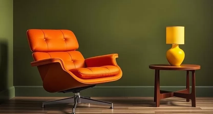
2. Atomic Age Brights
Bold and energetic, this palette reflects the optimism and futuristic spirit of the Atomic Age. It includes vibrant hues like bright teal, fiery orange, sunny yellow, and touches of charcoal gray for balance. These colors symbolize innovation and progress, adding a dynamic, playful edge to interiors. Perfect for making a statement, this palette is a standout option for Mid-Century Modern color schemes.
3. Scandinavian Simplicity
Influenced by Scandinavian design, this palette embraces minimalism and light. It favors crisp white, pale gray, soft blue, and natural wood tones. The result is a clean, airy environment that emphasizes serenity and simplicity. With its understated elegance and timeless appeal, Scandinavian simplicity is a classic and refined choice for Mid-Century Modern interiors.
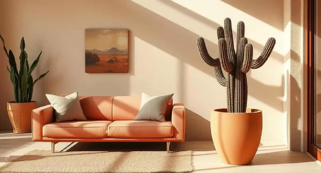
4. Desert Modern Hues
Inspired by arid landscapes, this palette features warm, muted colors that create a cozy, grounded atmosphere. Think terracotta, dusty rose, sandy beige, and soft sage green. These tones pair beautifully with natural textures and materials, offering a relaxed yet sophisticated aesthetic. With its unique charm and earthy appeal, this desert-inspired palette brings a modern warmth to any Mid-Century space.
Implementing Your Chosen Palette
Applying a color palette effectively requires thoughtful planning. Begin with the largest surfaces—walls are often best kept neutral to provide a versatile backdrop. Introduce your accent colors through furniture, especially upholstery, selecting fabrics that reflect your chosen hues. Layer in textiles like throws and pillows to add softness and visual interest. Decorative objects such as vases, lamps, and artwork help reinforce the palette and personalize the space. Don’t forget the role of natural light—it can dramatically alter how colors appear. Always test swatches in your actual environment to ensure the desired effect. With careful implementation, your color palette will not only enhance your space but also bring the essence of Mid-Century Modern design to life.
Specific Color Combinations for Success
Certain combinations consistently succeed. They embody the Mid-Century Modern spirit.
Explore the Best Color Palettes for Mid-Century Modern Interiors
1. Teal, Orange, and Walnut
This iconic combination exemplifies mid-century Modern style. Teal brings cool serenity, orange infuses the space with vibrant energy, and walnut wood adds grounding warmth. Together, they strike a perfect balance—lively yet sophisticated. Ideal for living rooms and dining areas, this palette delivers visual harmony and timeless appeal, making it a quintessential choice for Mid-Century Modern interiors.
2. Olive Green, Mustard Yellow, and Teak
This earthy palette radiates natural warmth. Olive green offers depth and calm, mustard yellow brings a cheerful touch, and teak wood provides richness and texture. The result is a cozy, organic feel that works beautifully in bedrooms and quiet reading nooks. Reliable and inviting, this combination is a consistent favorite in Mid-Century Modern design.
3. Charcoal Gray, White, and Red
Bold and contemporary, this high-contrast palette makes a dramatic statement. Charcoal gray lends sophistication, white adds clarity and light, and red delivers a vibrant pop of intensity. Perfect for minimalist interiors, this trio creates a sleek, refined aesthetic. It’s a powerful and confident choice that belongs among the best color palettes for Mid-Century Modern spaces.
4. Terracotta, Cream, and Sage Green
This calming palette brings a sense of peace and warmth. Terracotta introduces earthy richness, cream provides a soft neutral base, and sage green adds a gentle, natural touch. Perfect for relaxed environments like sunrooms or informal lounges, this combination exudes understated elegance. Its grounded beauty makes it a standout option in Mid-Century Modern design.
Lighting and Its Impact on Color
Lighting plays a critical role in how colors are perceived. Natural light shifts throughout the day, altering the appearance of hues. Artificial lighting also influences color: warm bulbs enhance reds and oranges, while cooler lights accentuate blues and greens. Consider the color temperature of your bulbs and choose lighting that complements your palette. Layer lighting with ambient, task, and accent sources to create depth and allow for mood variation. Thoughtful lighting ensures your colors shine and elevates the overall design impact.
Materials and Textures: Enhancing the Palette
Beyond color, materials and textures enrich the visual and tactile experience of a space. Wool, velvet, brass, and ceramics add depth and interest. These elements interact with light to enhance color richness. Wood grains introduce organic patterns, while glass brings transparency and lightness. Carefully selected materials not only support the color palette but also add character and sophistication to the design.
Avoiding Common Color Mistakes
A few key missteps can undermine even the best design intentions. Avoid using too many unrelated colors, which can lead to a cluttered, disjointed look. Stick to a cohesive palette and consider how natural light will affect color perception. Always test swatches in the actual space to ensure harmony. Don’t shy away from warm tones—Mid-Century Modern thrives on the balance between cool and warm elements. With thoughtful choices, your palette will support a visually cohesive and inviting environment.
The Best Color Palettes for Mid-Century Modern Interiors
Mid-Century Modern color palettes continue to captivate with their perfect blend of familiarity and freshness. Sophisticated yet accessible, they provide a solid foundation for beautiful, timeless interiors. Rooted in the design principles of the era while allowing for personal expression, the right palette can transform a space. With careful selection and thoughtful application, these color combinations bring the essence of Mid-Century Modern design to life—creating elegant, comfortable homes that feel both classic and current.
Are you an interior designer? What do you think about the best color palettes for mid-century modern interiors? Share your thoughts. Leave a comment.
![]()