ART & DESIGN
Designing a custom greeting card has never been easier. Follow these tips to create unique, beautiful cards for every special occasion.
BY EMMA RADEBAUGH, ARTCENTRON
Tips for Designing a Custom Greeting Card
A custom greeting card is an art form that showcases your personal style and delivers a meaningful message. Whether you’re designing a card for friends, family, or a broad audience, the card should reflect your style and unique message in order to leave a lasting impression on the recipients. Here are five tips for designing a custom greeting card that’s visually appealing and effective for numerous occasions.
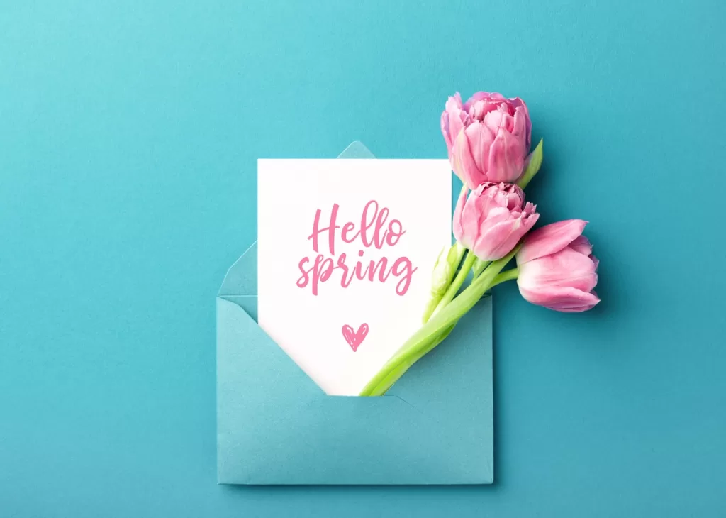
Use High-Quality Paper
The type and quality of paper you select will greatly impact the overall appearance and feel of the greeting card. High-quality paper feels better in hand and elevates the overall appearance of the card’s design.
For a premium look, consider a heavyweight or textured paper to add depth and dimension. These materials can make your design pop and stand out from standard store-bought cards. Remember that the paper you choose will also affect how your colors appear, so experiment with samples before making a final decision.
Consider Your Audience
Every design decision should align with the intended recipient or audience. Think about who the card is for; tailor the design to fit their preferences or the occasion.
On a birthday card, bold and fun designs work well, while elegant styles are suitable for anniversaries and formal events. If your audience is diverse, aim for versatility by incorporating traditional holiday or celebratory imagery with classic color palettes.
Define a Color Palette
A cohesive color palette can unify a card’s design. Start by deciding on one or two dominant colors, then add complementary tones to create a balanced color palette.
For more festive occasions, bright palettes can work wonders. Muted tones offer sophistication for events like weddings or corporate events. Consistency in color helps guide the viewer’s eye and determines the emotion the card evokes.
Balance Imagery and Typography
When designing a greeting card, strike a balance between visuals and text. The message should be clear and easy to read without being overshadowed by the design elements. Strong typography choices will enhance your card’s attractiveness while clearly conveying the message.
For instance, choosing the best fonts for birthday cards can have a significant effect on the recipients. Playful display fonts are ideal for a cheerful vibe, and script fonts provide a timeless, elegant touch. Combine this with well-framed imagery, leaving enough negative space to ensure readability.
Ask for a Second Look
Before finalizing the design, always get a fresh perspective from another creative eye. Share the draft with a friend, co-worker, or another artist whose opinion you trust. They can point out areas you might have overlooked, like awkward font placement or color clashes.
Feedback highlights opportunities for improvement that can improve the card’s design. Even minor tweaks based on a second glance can elevate the overall quality, ensuring your card looks polished and professional.
A custom greeting card can be a true reflection of your artistry and creativity. With the right materials, thoughtful design choices, and attention to detail, you can create something memorable and meaningful.
Are you a greeting card designer? Share your best tips for designing a custom greeting card. Leave a comment.
![]()